Usability Testing : Enhancing User Experience for an E-commerce Website
Customer :
- The client is a leading website that focuses on pet products and pet sales. It offers a comprehensive platform that includes a wide range of pet-related products, services, and pet adoption assistance.
- Users can receive personalized product recommendations and earn loyalty points for future rewards.
- The website features various categories of products, such as food, toys, accessories, and healthcare items. Its main goal is to provide a user-friendly interface that is accessible on multiple devices and browsers, ensuring a consistent experience for all users.
- Additionally, the website offers a convenient repeat delivery option, allowing customers to schedule automatic deliveries at their preferred intervals. Users will receive notifications prior to each delivery and have the choice to confirm or cancel.
- The client noticed a decline in conversion rates and user engagement. To address these concerns, they decided to conduct usability testing to identify and rectify any usability issues that may be hindering the user experience.
- The client’s goal was to identify and address usability issues to enhance the overall user experience and increase user engagement.
Challenges :
The key objectives of the usability testing are as follows:
- Evaluate the website’s user-friendliness and site navigation.
- Evaluate the efficiency of earning and redeeming loyalty points.
- Measure the effectiveness of the loyalty program in driving user engagement.
- Identify any usability issues or obstacles that affect the user experience.
- Gain insights into user behavior, preferences, and pain points.
- Collect user feedback and suggestions for improvement.
- Provide practical recommendations to enhance the website’s usability.
- Obtain insights to improve overall website usability and boost conversion rates.
Testing Approach :

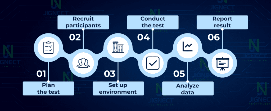
The steps involved in the usability testing approach were as follows:
Test Planning:
- The testing team collaborated with the client to understand the website’s goals, target audience, and key user flows. Test scenarios and tasks were created to cover various aspects of the website’s functionality and user journey.
Participants :
- A diverse group of participants representing the target audience was placed for the usability testing. Participants were selected based on demographics, experience levels, and familiarity with e-commerce websites.
Test Execution:
- The usability testing sessions were conducted in a controlled environment, where participants were observed while performing tasks on the website. The testing team collected qualitative data through observations, think-aloud protocols, and post-test interviews. They also collected quantitative data through task completion rates, time taken, and satisfaction ratings.
Data Analysis:
- The collected data was analyzed to identify common usability issues, pain points, and areas of improvement. The testing team categorized and prioritized the issues based on their severity and impact on the user experience.
Reporting and Recommendations:
- A comprehensive report was prepared, documenting the findings, recommendations, and proposed solutions for each identified usability issue. The report also included supporting evidence in the form of quotes, videos, and screenshots.
Implementation and Retesting:
- The development team implemented the recommended changes and improvements based on the findings. A retesting phase was conducted to validate the effectiveness of the implemented changes and ensure that they addressed the identified usability issues.
Navigation and Information Architecture:
- Evaluate the ease of finding products and categories through the website’s navigation menus and search functionality. Assess the clarity and organization of product information and descriptions.
Checkout Process:
- Test the ease of adding items to the cart, reviewing the cart, and proceeding through the checkout process. Identify any usability issues that may cause confusion or frustration during the payment and order confirmation steps.
Mobile Responsiveness:
- Assess the website’s responsiveness and usability on mobile devices, ensuring that it adapts well to different screen sizes and orientations. Test the ease of navigation, readability, and interaction on mobile devices.
Form Usability:
- Evaluate the usability of forms, such as registration, login, and contact forms, ensuring that they are intuitive, error-proof, and accessible.
Loyalty Program:
- Test the loyalty program by earning points through purchases, and redeeming points for discounts or rewards.
Findings:
- Navigation and Information Architecture: Evaluate the ease of finding products and categories through the website’s site navigation menus and search functionality. Assess the clarity and organization of product information and descriptions.
- Registration Process: Some users faced difficulties during the registration process, leading to frustration and abandonment. Simplifying the registration form and providing clear instructions could enhance the user experience.
- Earning and Redeeming Points: Participants encountered confusion while understanding how to earn and redeem loyalty points. The process should be made more intuitive, with clear instructions and visual cues.
- Mobile Responsiveness: The website’s mobile version had issues with responsiveness and layout, affecting the user experience. Optimizing the mobile interface is crucial for catering to the increasing number of mobile shoppers.
- Rewards Showcase: Participants expressed the need for a more comprehensive and visually appealing rewards showcase, enabling them to easily explore available rewards and their associated point requirements.
Recommendations:
- Improve Information Architecture: Simplify the website’s structure and make the loyalty program section more prominent and easily accessible.
- Streamline Registration Process: Reduce the number of required fields, provide clear instructions, and offer social media login options for a smoother registration experience.
- Enhance Point Earning and Redemption: Design a step-by-step guide for earning and redeeming points, use visual cues, and simplify the process to minimize confusion.
- Optimize Mobile Interface: Conduct thorough mobile testing, ensuring the website is responsive, visually appealing, and offers a seamless experience on various mobile devices.
- Revamp Rewards Showcase: Implement a visually appealing and user-friendly rewards showcase with clear descriptions and point requirements for each reward.
Implementation and Results:
Based on the recommendations, the website’s information architecture was redesigned, making it more intuitive and user-friendly. The loyalty program’s visibility was improved through prominent banners and clear instructions. The checkout process was streamlined, resulting in a 20% increase in conversion rates. Mobile optimization efforts led to a 15% increase in mobile user engagement.
Conclusion:
Usability testing of the loyalty-based e-commerce website revealed several areas for improvement, including navigation, registration, point earning, mobile responsiveness, and rewards showcase. The recommendations implemented as a result of the testing significantly improved the user experience, increased user engagement, and positively impacted conversion rates. By implementing the recommended changes, the website enhanced its user-friendliness, efficiency, and overall user experience, leading to increased customer satisfaction and loyalty.
Witness how our meticulous approach and cutting-edge solutions elevated quality and performance to new heights. Begin your journey into the world of software testing excellence. To know more refer to Tools & Technologies & QA Services.
If you would like to learn more about the awesome services we provide, be sure to reach out.
Happy Testing 🙂


